Branding of an artisanal pasta
Strategic analysis and brand image of an artisanal pasta new business in Sao Paulo.
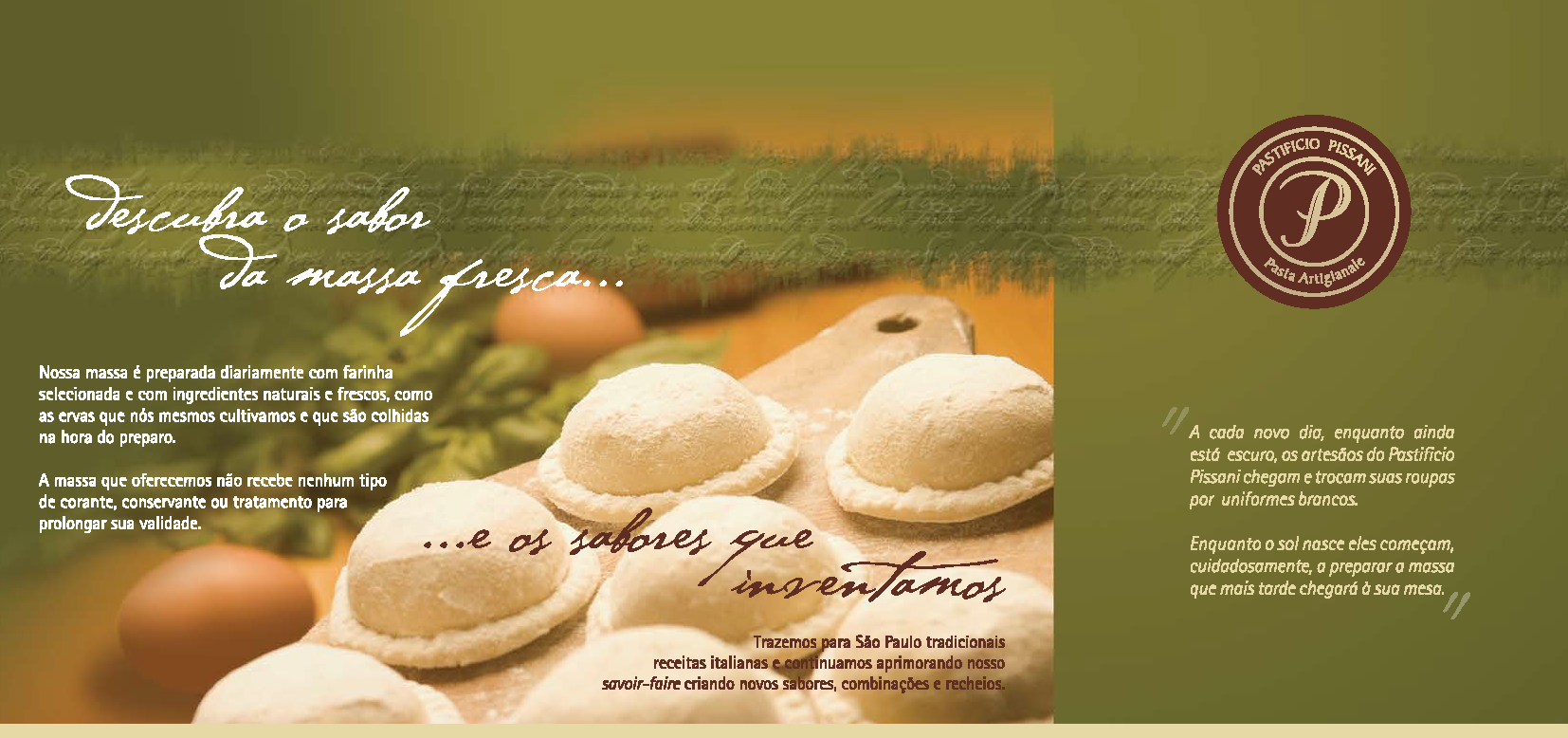
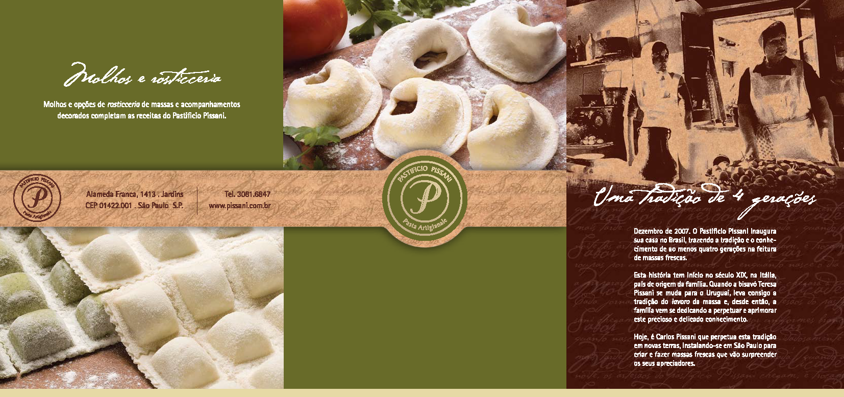
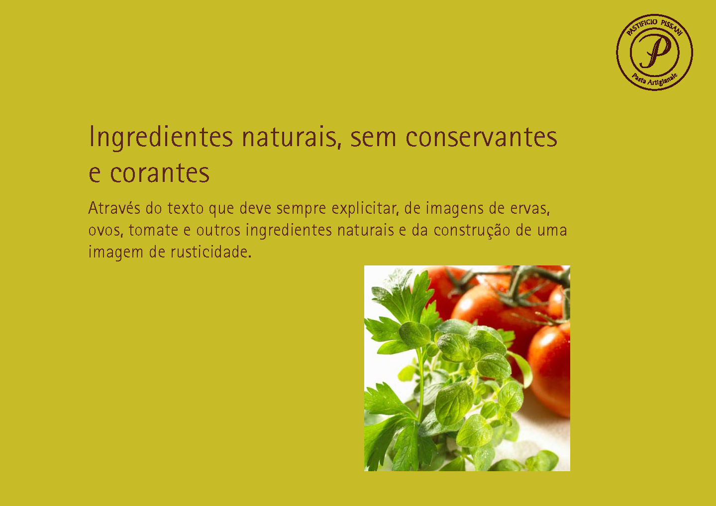
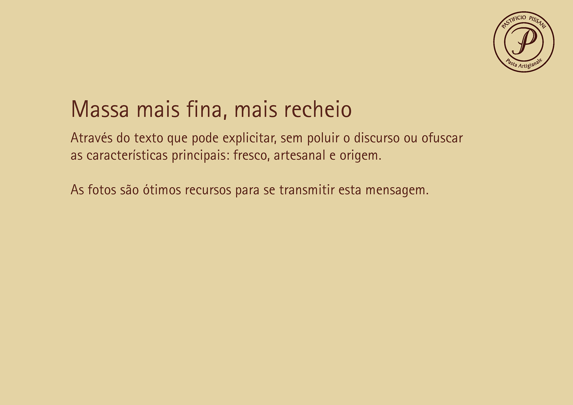
The product differentiating features were already defined: sophisticated recipes, ultra fresh, artisanal and only the best (& fresh) ingredients.
If the pasta were so superior than the competitors products, how could the brand image differentiate it?
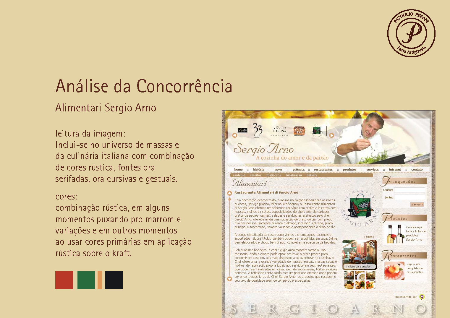
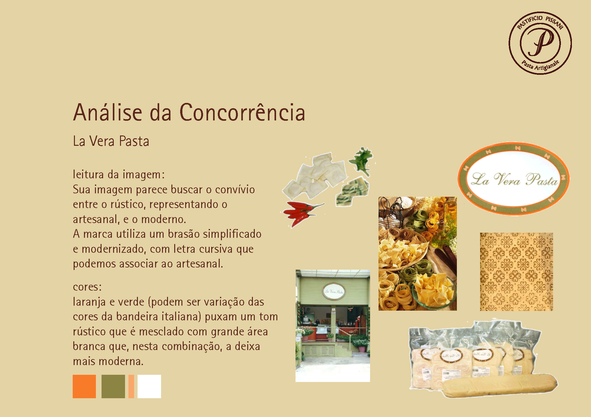
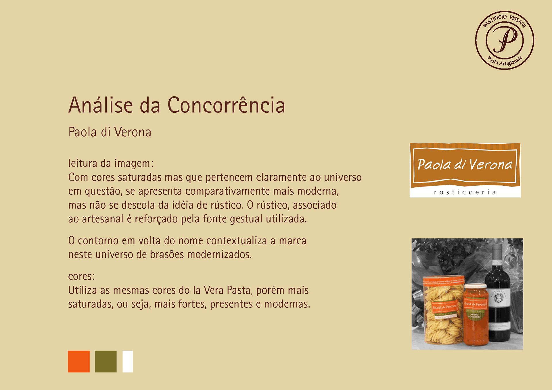
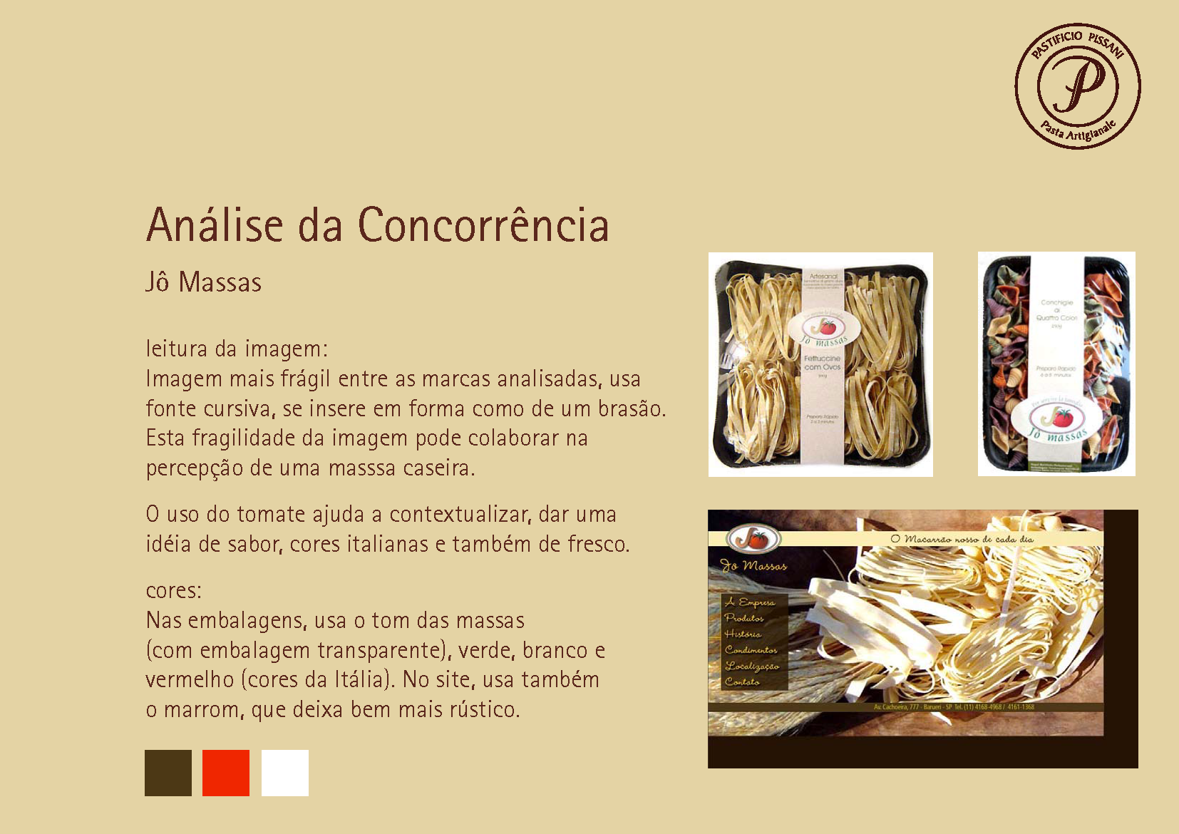
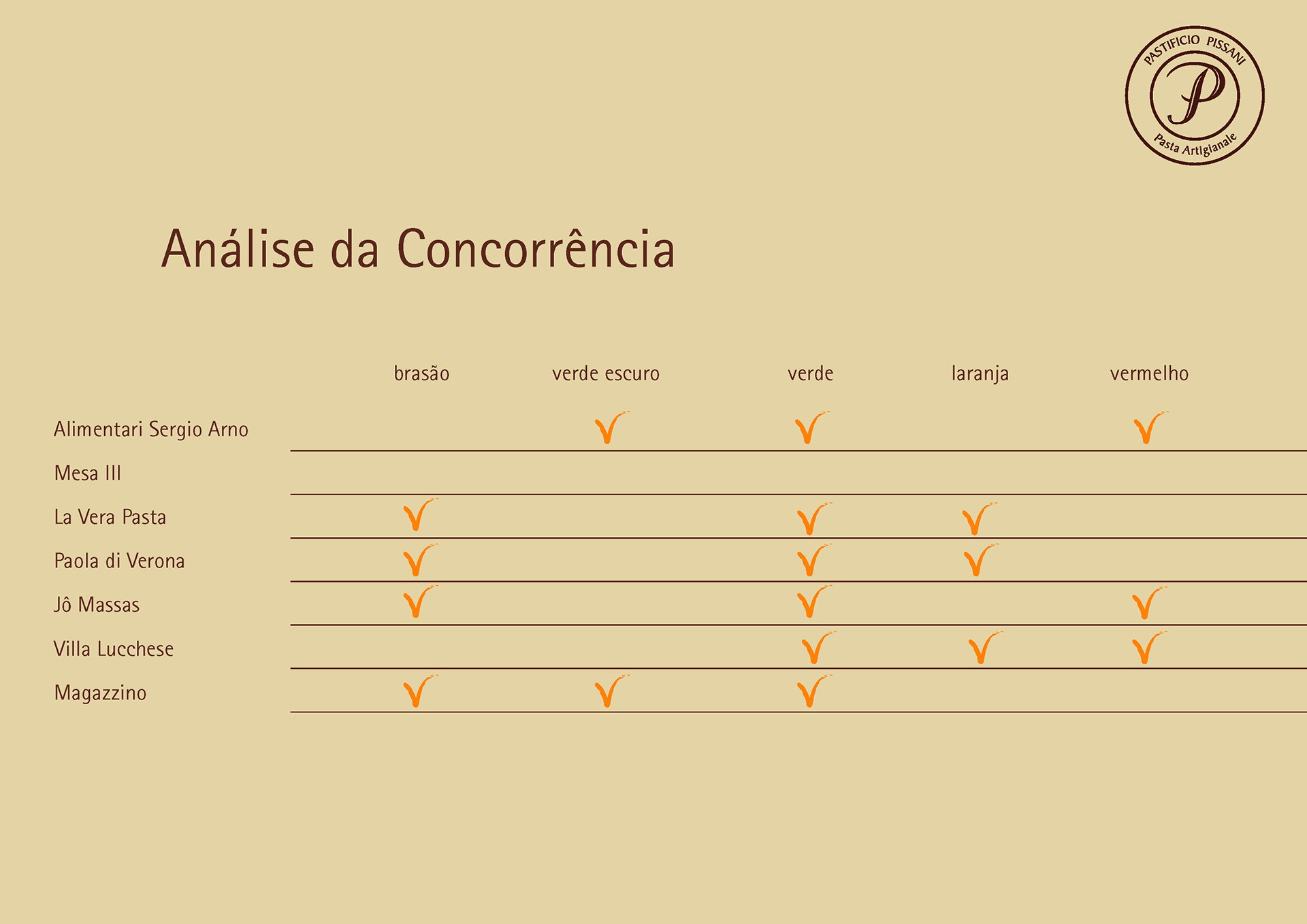
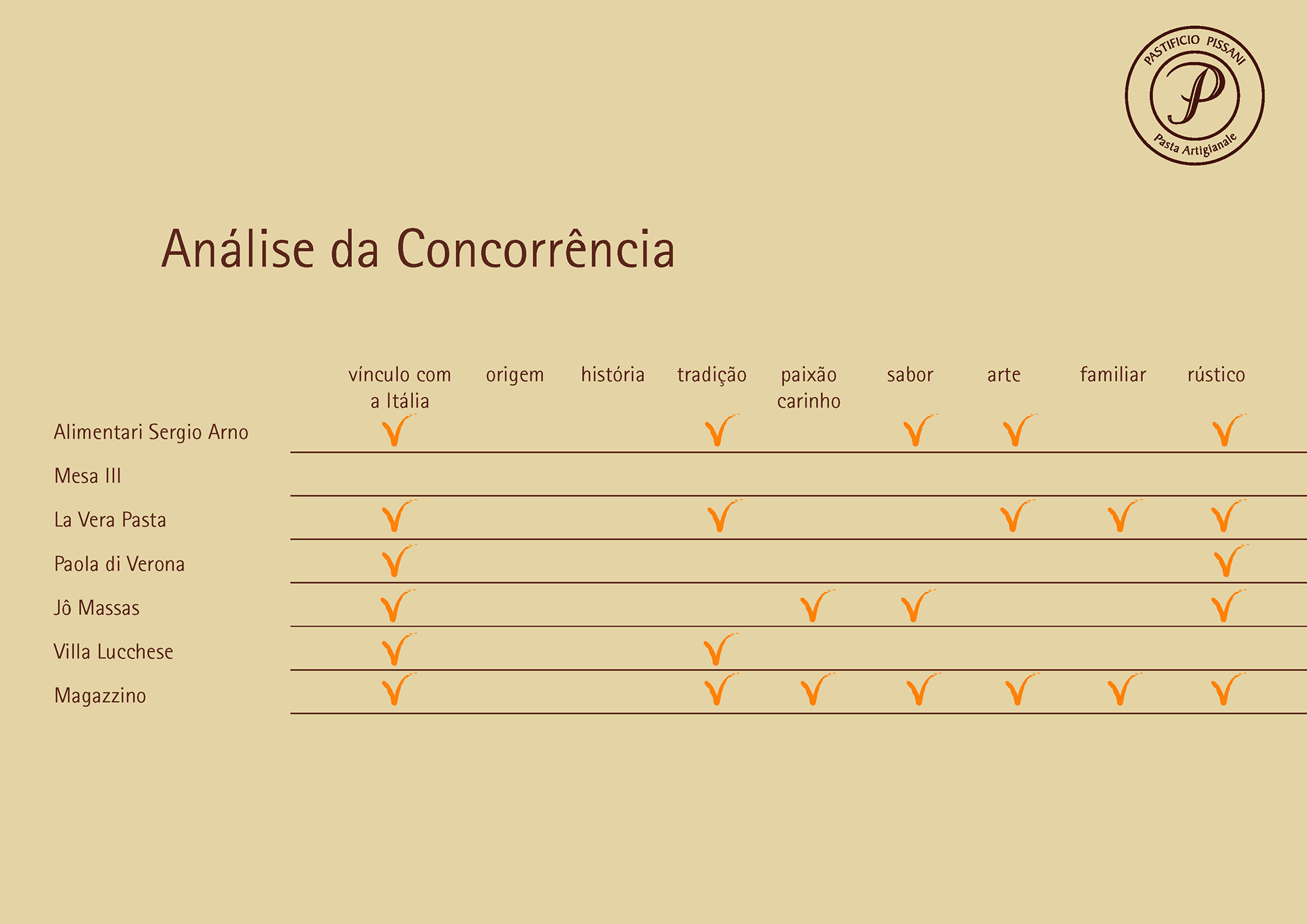
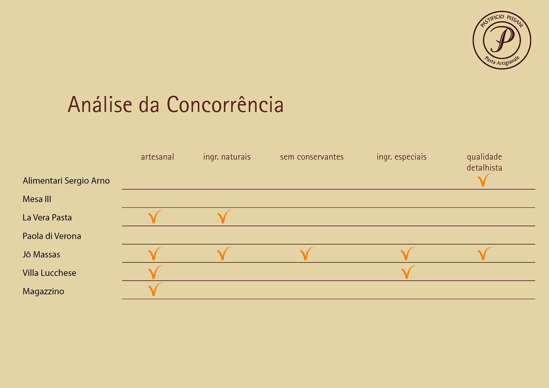
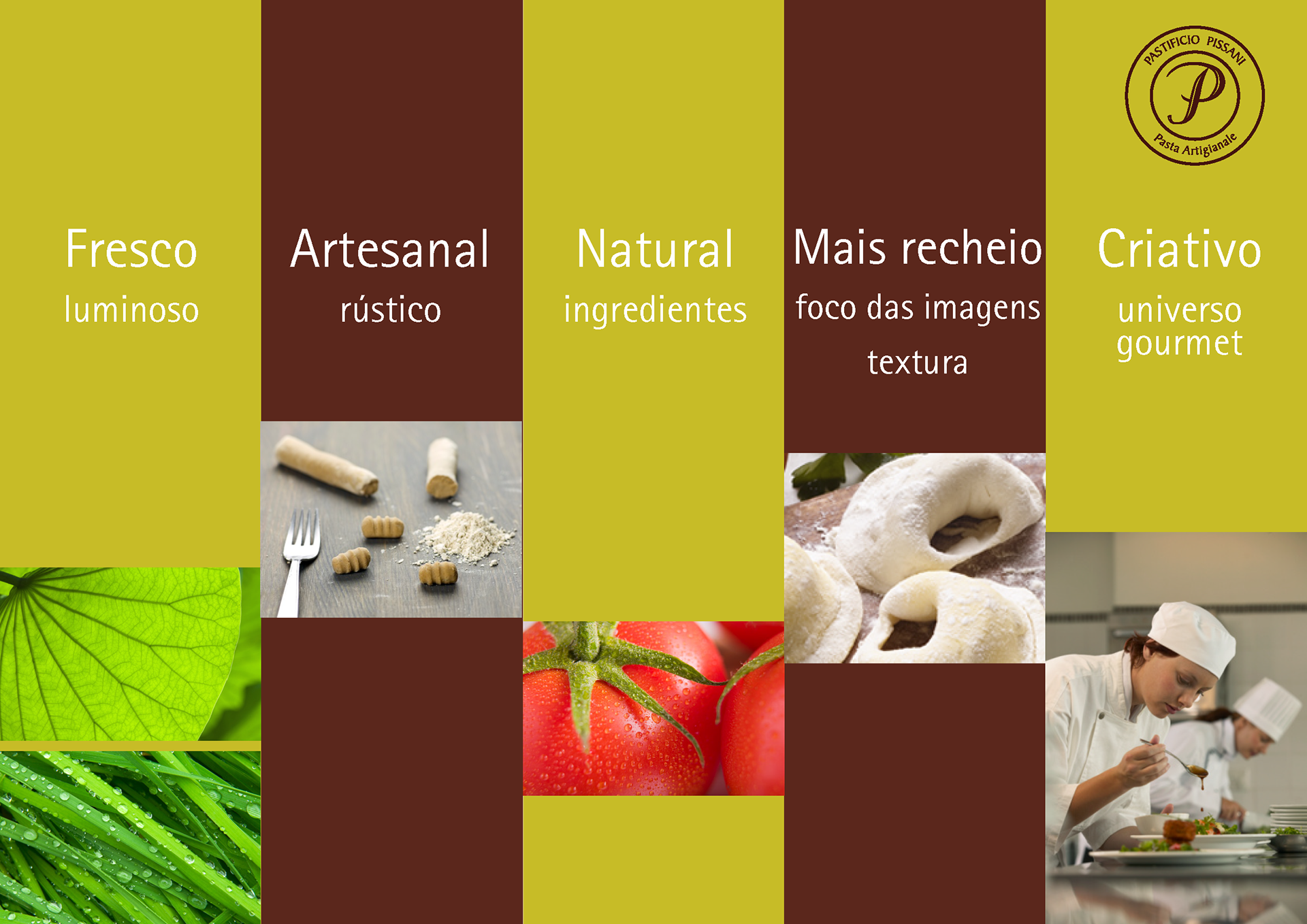
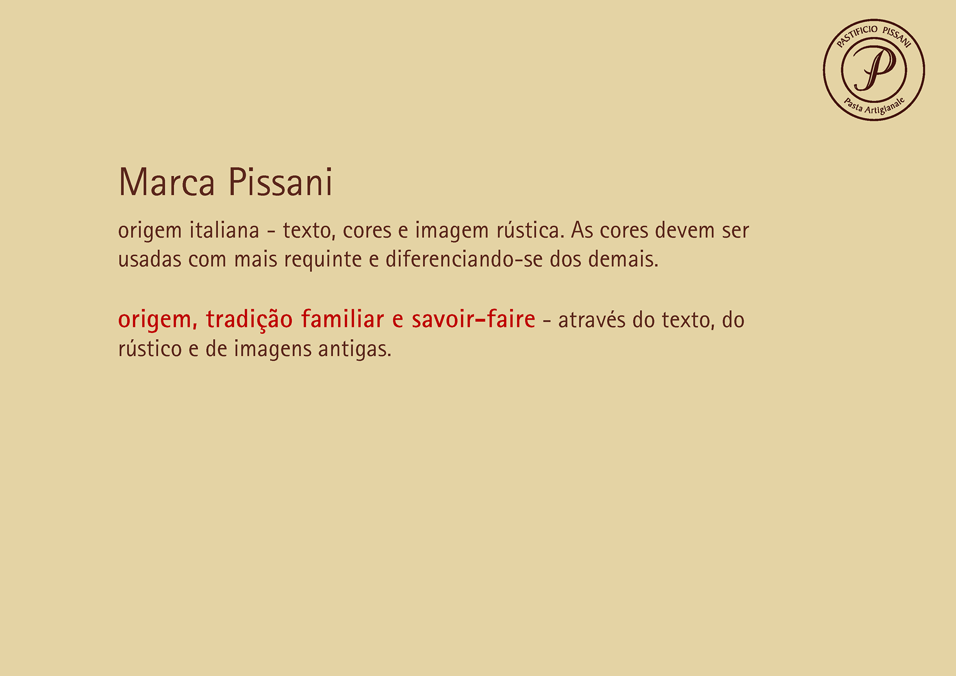
In our market research we found that most of the competitors images were similar: Italian flag colours, cursive letters, a kind of rustic and traditional. Part of them uses a coat armour, suggesting tradition. Our intention was to use new elements to differentiate Pissani, as well as being coherent with the product they sells.

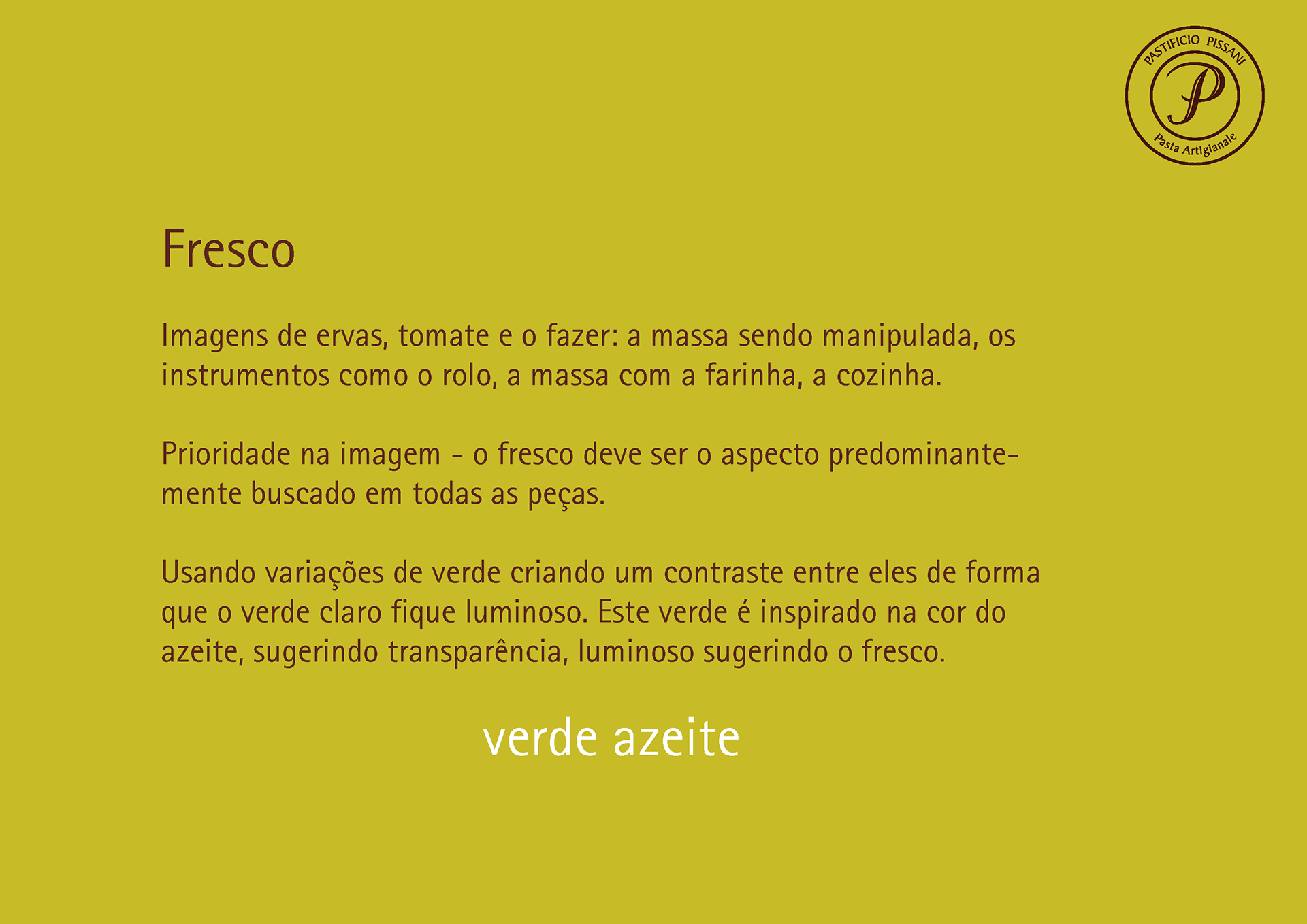
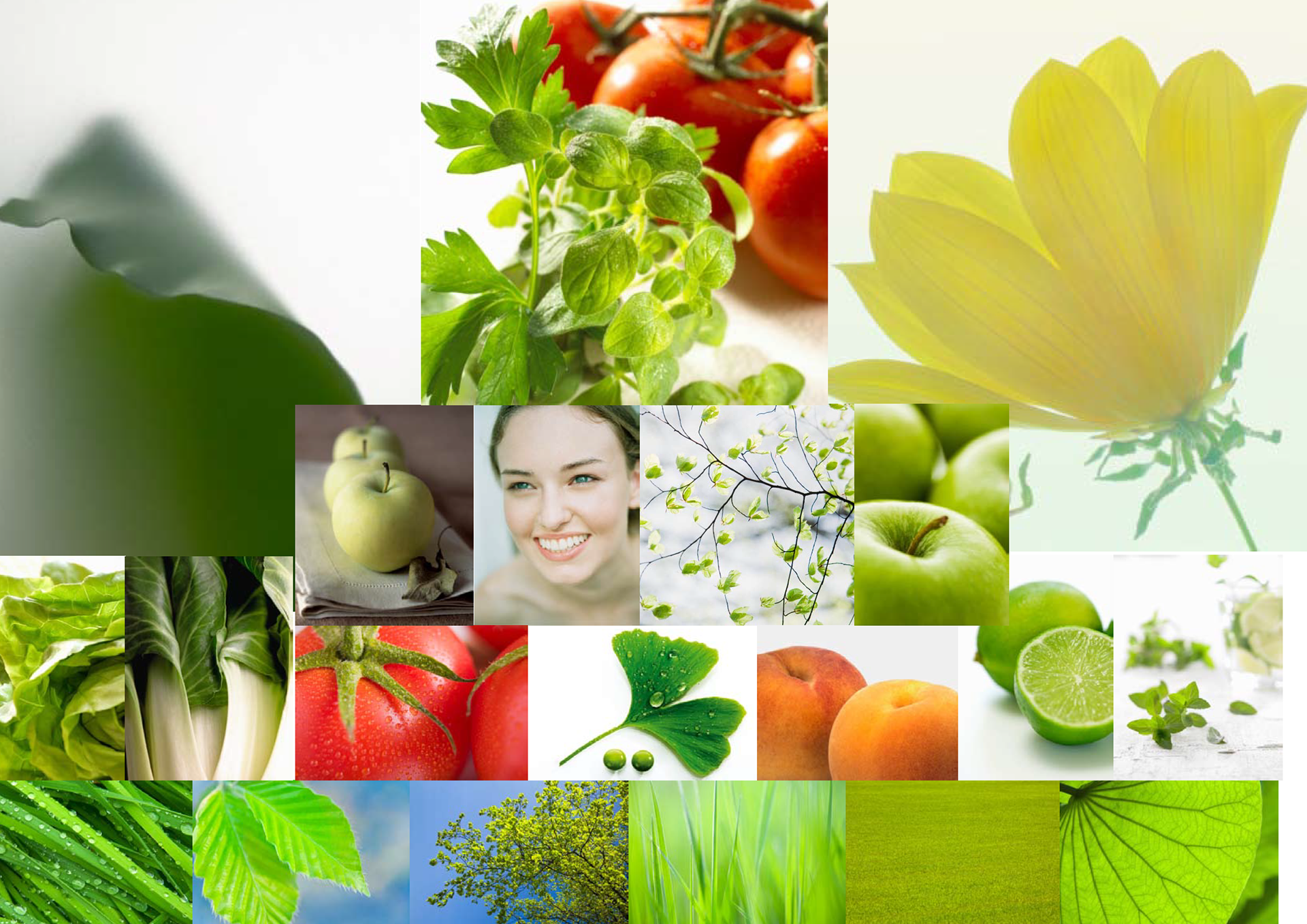
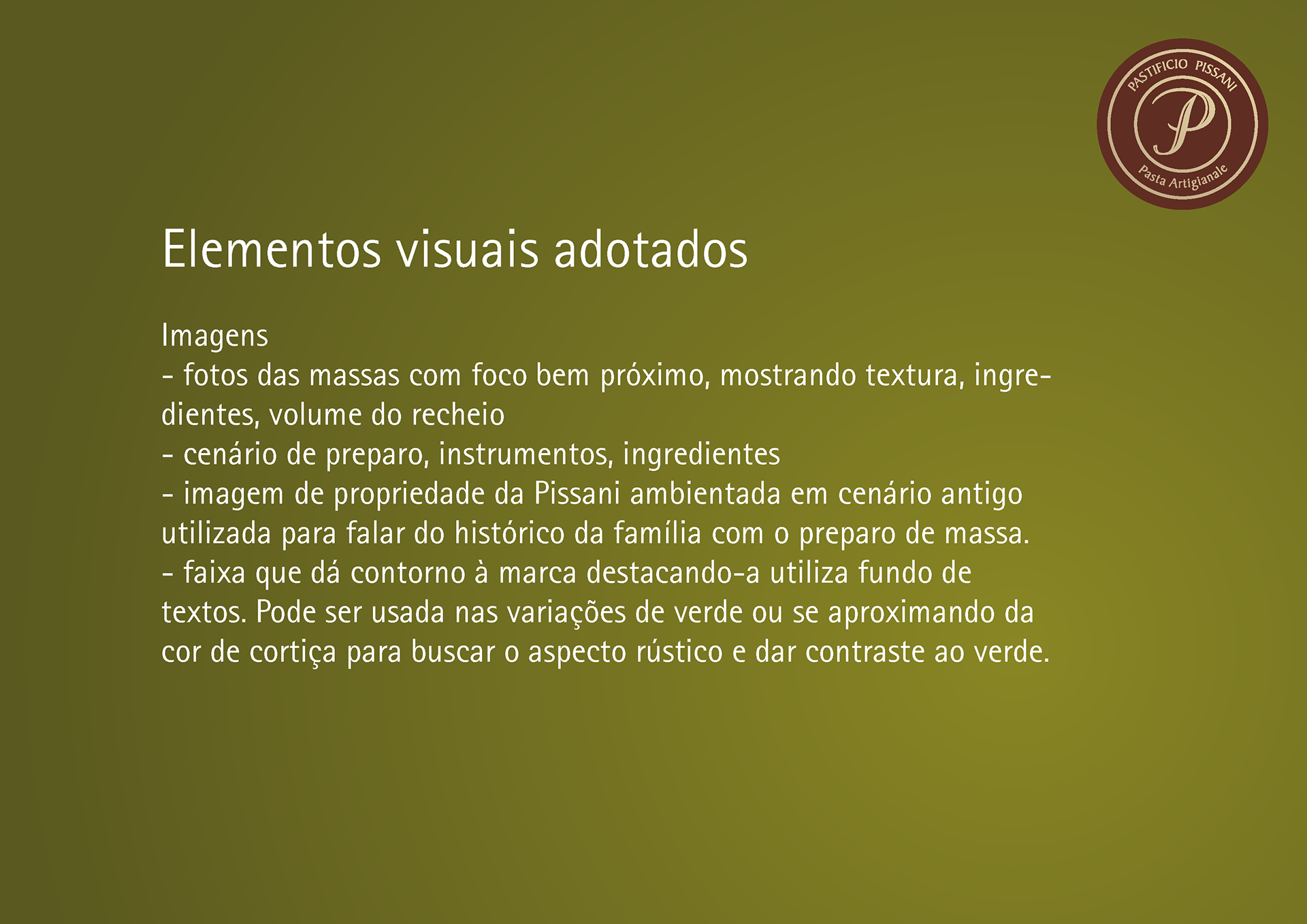
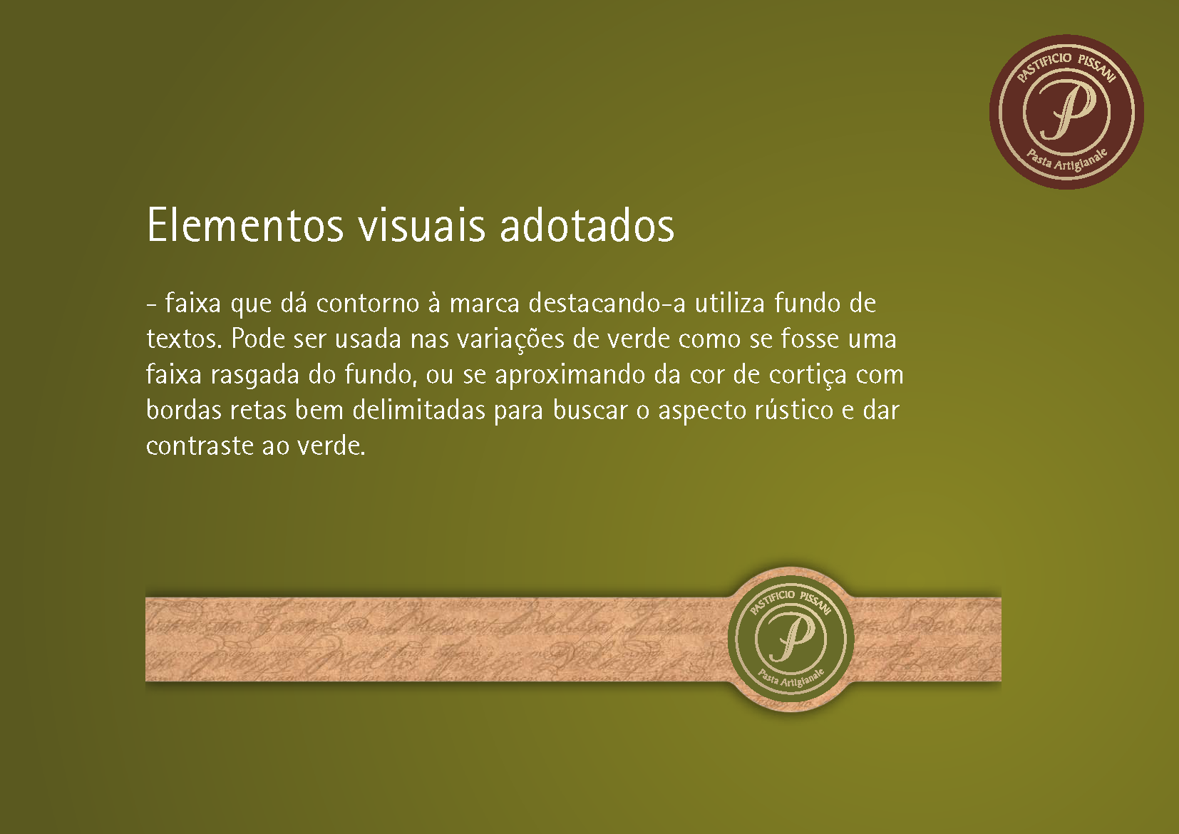
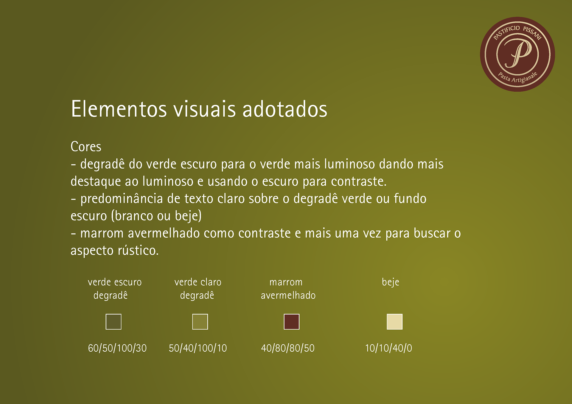
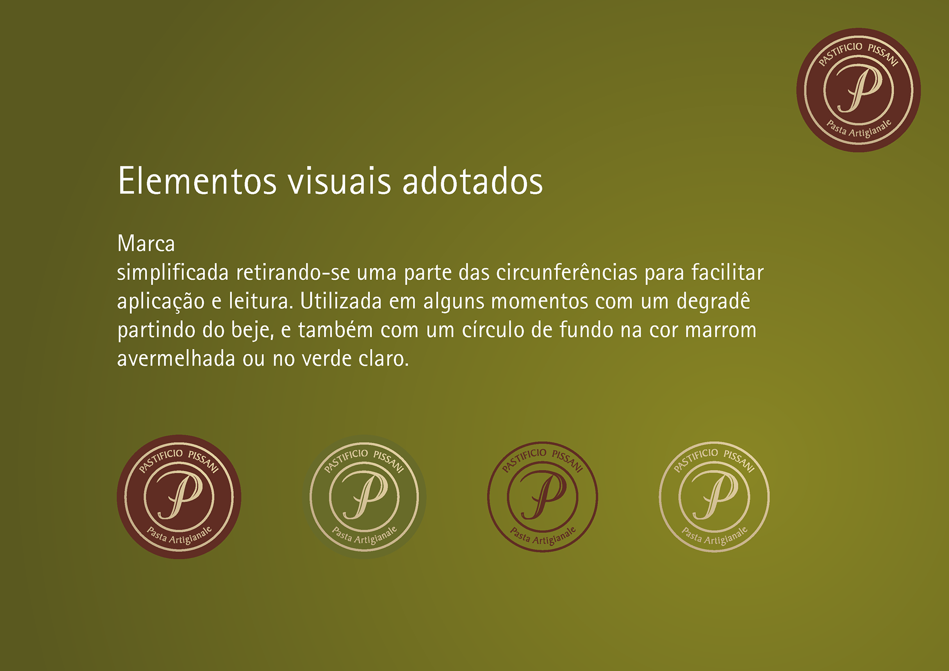
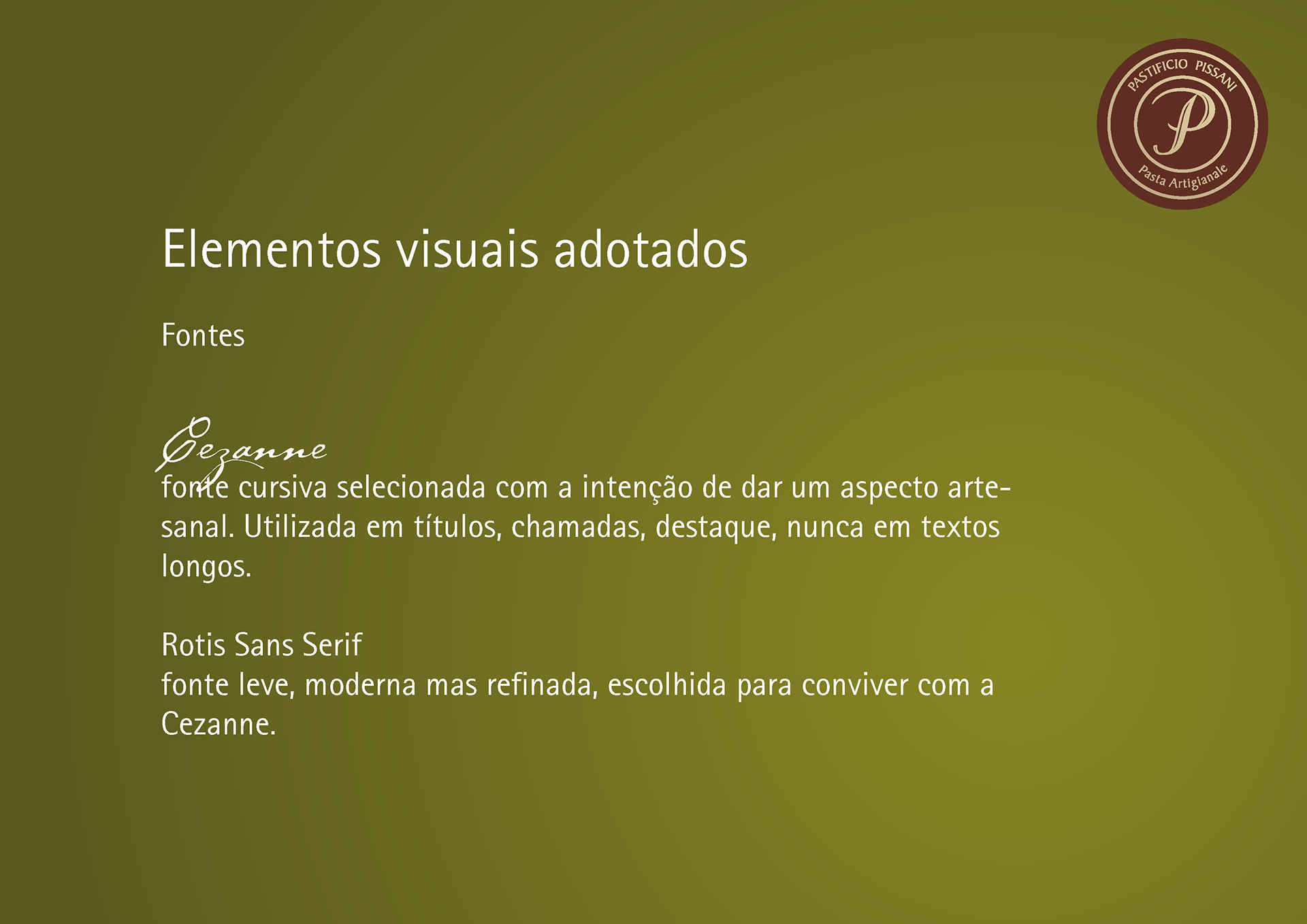
A luminous green, inspired on olive oil, was chosen to bring freshness to the brand image. A dark green to be used in gradient and contrast to the light one. A band simulating cork and brown color to make it rustic and traditional. A cursive typeface that sends to artisanal and artistic. Another typeface for better reading and modernity. Pictures guidelines to show fresh ingredients and the pasta texture.
Some orientation was made for the logo application, but the logo itself was maintained as it was before.